
Creating an Effective Giveaway Graphic
The graphic for your giveaway will be the first thing people are likely to spot and can help them decide whether or not to click it. These six tips will help you create an eye-catching banner image for your next giveaway!
Tip 1: Use the most effective, standard banner sizes
Each platform will have a preferred layout, size and shape they use for all of their media. It’s important to research what sizes work best for each. Instagram, for example, uses more of a square shape compared with Facebook, which is more of a rectangle. You can current social media asset sizing here.
Tip 2: Include your brand
Your brand separates you from everyone else. It should be included in your graphic to push exposure further. Fans of your content creation may only click on your graphic once they spot your brand/logo. It should be visually dominant but not hold the main focus over the value proposition or the call to action.
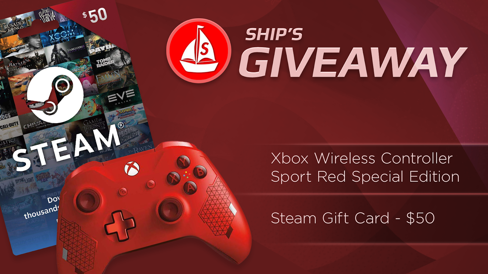
Ship’s graphic uses his logo by the title as well as keeping the color theme of his brand. Even the prize is the right color!
Tip 3: Value proposition should be taking up the most space
You are “advertising” what you are giving away after all so the prize should be the main focus of your graphic. If visitors are looking for a certain prize, they might overlook a graphic when the first thing that draws their eye is a logo or a selfie.
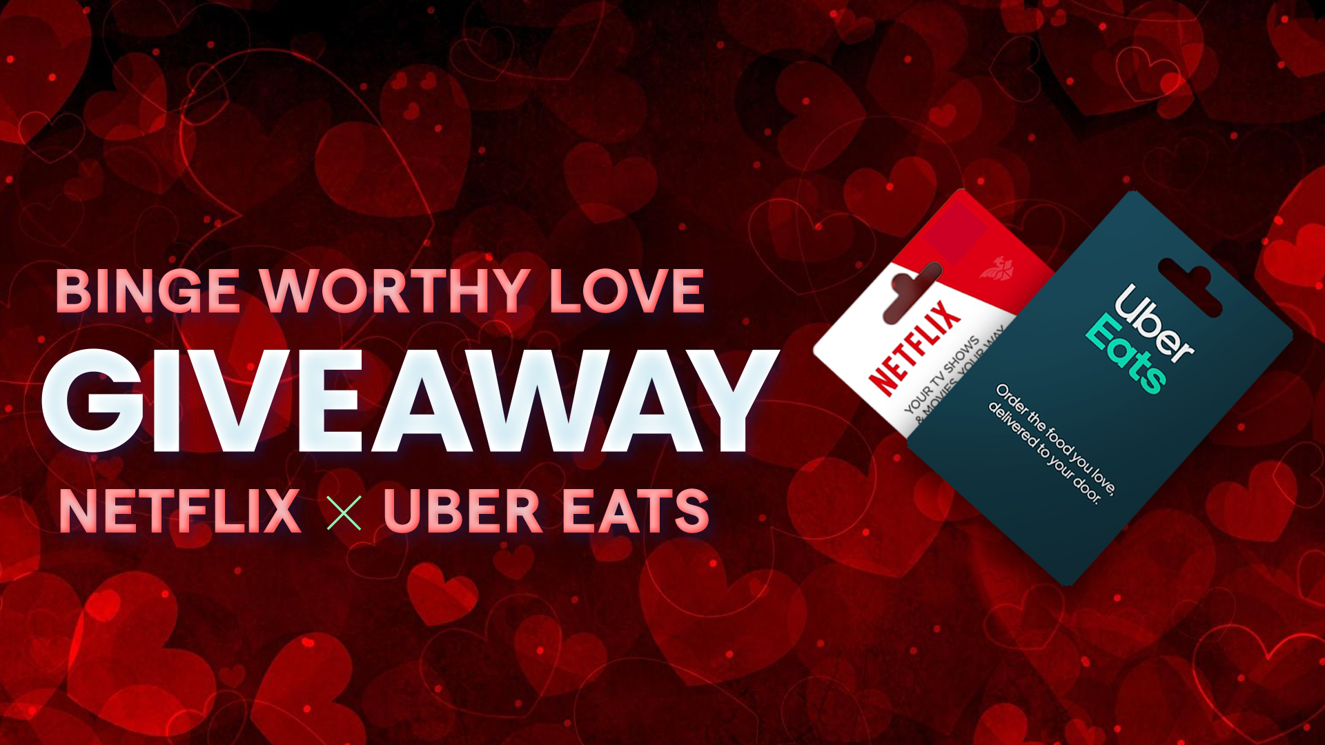
An example of a graphic [shown above] that shows the prizes clearly at the front and let’s you know in a large font exactly what the graphic is trying to show you. Our brand is still shown at the bottom, but it does not take away the focus.
Tip 4: Keep it simple
You do not need to have every detail on a giveaway graphic, just the important things. You might be tempted to add every prize, specification and entry method but remember there are places for that on our site. Your graphic should include a title, picture of the prize and your brand before anything else.
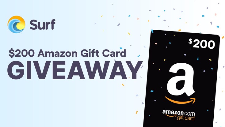
An example of a simplistic graphic [shown above] where the text gives all the information
and the images compliment the design.
Tip 5: Make sure your text is instantly readable
It’s easy to get caught up in fancy fonts and making your graphic unique with editing tools but it can sometimes make the text unreadable. A graphic can look beautiful but if it does not serve its purpose, then it’s not worth the time to make and use.
Tip 6: Use appropriate Colours
Bright colours on graphics are not a bad thing however clashes and the wrong contrast with text can look awful. If you are unsure of what colours work well together, you are able to find plenty of articles and examples online of great combinations!
The main challenge of designing a graphic for your giveaway is to blend creativity and marketing messages in the proper way. Following these tips will help you to create an image which delivers the message as well as looking the part!
--
Have questions? Reach out to us at success@joinsurf.com!